Sure, you've seen this illustration of the difference between serial and parallel processing:
But have you seen this illustration of Marilyn Monroe?
 I was recently asked 'What makes a photograph fine art?'
To me, any object that transcends itself in communicating has become fine art. A photograph is just a photograph until it is an outstanding photograph.
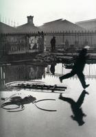
Henri Cartier-Bresson arguably took a lot of dull snapshots with his new 35mm camera but many of the shots, at least of the ones we get to see, pull me into them and tell me more about the scene than just what the camera saw; they also tell me what the photographer saw. That is fine art.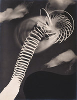
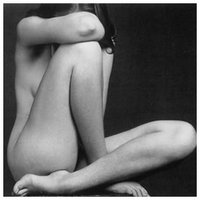 Edward Weston created photographs that confused the nature of shape and juxtaposed sensuality and mundanity. If it's a fruit that looks like a nude, it's a Weston. If it's a nude that looks like a fruit, it's a Weston. That is fine art.
Fine art tends to be non-commercial, but much commercial artwork rises to the level of fine art. Fine art can be simple or complex; detailed or vague; urban or natural; nude, clothed or devoid humans. It can tell a story, explore shape or form or color or tone, challenge our intellect or remind us of childhood. This list could go on forever.
In the end, the question is completely subjective and one person's fine art is another person's trash. Andres Serrano's 'Piss Christ' was railed against by Christians who felt he was maligning their faith. They were angered that the National Endowment for the Arts rewarded him with a $15,000 prize because they felt it was blasphemous rather than artistic. Ironically, one of the recognized purposes of art is to illicit an emotional response, which this certainly did.
I recently ran across an article on hongkiat.com titled 50 Great Photographers You Should Know. With a list that long i'm a little disapointed I didn't make the cut, but there's a lot of good stuff in there.
Go look but be aware that they're not all safe for work.
Io9 has an article on turning Zira Island, possibly the Caspian Sea's most poluted area, into an eco-resort. I love the idea of using tourism as an excuse to clean up an area and treat it properly. But the first thing I noticed in the photos of the island were the abandoned ships off the north coast. They're one of the things that needs to be cleaned up before they can build billion-dollar hotels on the island.

But what I want is to go there and take pictures of the wrecked ships all over the place. It looks like an awesome environment to shoot in and a quick Google image search tells me nobody else has done it yet. Now... to convince my investors!
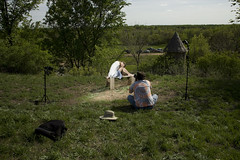 David Hobby over at strobist.com has brought up an interesting and controversial subject: working for free. Go and read it, I'll wait....Yeah, I know it's long, skim it if you have too. I'm pretty patient though, so take your time...
See, that was worth it, right. So now, you're thinking things like this:
"Why would I do work that someone else, including myself, would charge for? I'd essentially be taking money out of their pockets. I could become known as the guy who works for free, which is never good, and if I mention it to professionals in the same field, they'll scoff, try to convince me otherwise, and probably never speak to me again."
But the idea does have it's merits within reason.
David gives several good reasons to work for free and I think they're all valid. I think a little clarification is needed as he doesn't go into the basic economics of the situation.
If, as David suggests, you are the initiator of a project and if your primary goal is creating something for your portfolio and if this project requires outside talent to be completed, then you are in the position of needing to hire that talent. Trading work for work is what economists call the "barter system" and it has been in place since the oldest profession got its start.
Just be careful about what you do for free. As David says, don't give a potential customer a free lunch. I would add that if there's any question make it clear that you normally charge for this and, unless there's another mutually beneficial situation, you would charge them in the future just as you would expect them to charge you if you needed their services.
Provided you stick to the rules, you're unlikely to be in the position of "Hey, what's the deal? Last time you did this for free!"
Edit: Like The Strobist, I'm seeing this from a photographic point of view, if you work in a field where you don't need anyone else's help, your economic mileage may vary.
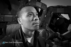 It could be argued that there are two types of photographers in the world: professionals and amateurs. Well, it could also be argued that this is a two-dimentional continuum with the second axis being good and bad photographers, but that's not the point of my story. Since I'm a good photographer, I'll try to keep my focus narrow.
When it comes to photography, I am first and foremost an amateur. While the word has been co-opted and bastardized by the professionals who spit it at photographers who aren't very good, the soul of the word really defines one who does something for the love of it. Unfortunately, there's not usually a lot of money in being an amateur. Almost by definition, an amateur is not often paid for what he does. That makes exercising a love of one's art more difficult and brings more venom from the professionals who lose money to those who will do their jobs for free.
I am also a professional. This is another word that has been used in many ways and I consider most of them to apply to me. I am professional in that I respect my subjects and my peers and in that I get paid to make photographs. I don't do enough work-for-pay to completely support a life of photography and I'm not even sure I'd want to. As a result, I find myself straddling the definitions and trying to carve out a meaningful place for me to stand.
This line between occupation and avocation is a hard one to walk and I don't think I want to do it forever. The more I want to put into my avocation, the more I have to put into my occupation to fund it. And the more my avocation is self-funding, the more it can feel like work.
A good friend of mine got married last month. I didn't offer her my services as a photographer, though maybe I should have. I'm not all that interested in weddings because there's a lot of pressure and you only get one shot to get it right. On the other hand, weddings pay well and I've done enough of them to know I'm more than capable. If I were to make a living from wedding photography, I'd need to shoot an average of one wedding every week of every year. That means advertising, customer coordination, billing, and more retouching than I'd like to think about right now. If I hired someone to deal with the business aspect, I'd have to shoot twice as often. If I wanted a studio; half again as often.
Anyway, another friend of mine, who was the bride's cinematographer, got into a conversation with the wedding photographer about seating and dining arrangements while they were grabbing their place cards. The photographer saw my name on the board and was mentioned that he had heard of me. "You want to sit next to him? I can make that happen." the cinematographer asked. Later, at dinner, she waved to the photographer, who was standing next to me, and said "Hey! This is Ben Zvan!" by way of introduction. He turned to us and said, "Yes, I know. I'm working up to it. It's kind of like meeting Jesus."
Obviously, I didn't have a ready response to that one. I guess it means I have something of a reputation among at least some photographers. The real question is whether or not a reputation is all I want or if I need to work toward a profession. Many artists are most recognized posthumously and, while that would be great, I don't think I'd enjoy it as much as being recognized now.
By Ben Zvan
On October 06, 2008 at 13:37
Photography
As an assignment for my art history class, I wrote some comments about this photograph hanging at the MIA.
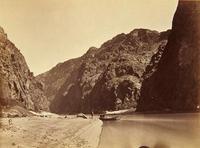 At first glance the familiar, approximately 8 x 10, size of this photograph is quite disarming. Aside from the sepia coloring of the black and white image, there is little to indicate that this is not a modern photograph of the American west. However, upon closer inspection, the smooth, glass-like, almost foggy quality of the water gives away the length of time necessary to expose a negative in 1871. While it is likely that O’Sullivan used a very large aperture during this long exposure, the depth of field reaches from the extremely close foreground nearly to infinity, enhancing the modern appearance of the image.
The mountainous walls of the canyon are impressively rendered as the high angle of sunlight on the stone brings out the ruggedness of the landscape. Even though the image is a classic example of landscape photography, that high angle of light brings out a definition of shape that gives the image the appearance of an intentionally lit portrait. The impression is great enough that the eye searches the walls of rocks for faces, like scanning a crowd.
The inclusion of the boat and figure near the center of the photograph gives the image a portrait-like quality as well. If the viewer didn’t already know that the picture is part of a documentary project commissioned by the war department, he could easily believe it to be a travel photograph taken to commemorate a family expedition. The inclusion of the bow of the photographer’s own boat and footprints reinforce the impression that this is not staged, but a recording of an event as it takes place.
The searching for faces also leads the viewer to an object that continually draws my attention. In the lower-left corner is a shape, like a lower-case “e” made by something unidentifiable. Possibly, this is something that a veteran wilderness explorer would recognize instantly. Possibly, it is an artifact of this particular technician’s albumen printing process. It leaves a question in the viewer’s mind about the reasoning or lack thereof behind including this shape in the final print.
Originally taken as documentation of The United States’ western expansion in the late 1800s, the photograph may have been intended to show the rough, untamed nature of the landscape that Americans had yet to conquer. In this regard, it is successful as the figure and boat give a sense of the sheer volume of stone above the river and indicates that the location would be impossible to access by any other means. The image is successful in other ways as well. The landscape was not only untamed wilderness, but a majestic scene that would be visited by millions of people in the century to come.
At the same time, the image seems devoid of opinion of its purpose. Is it intended to show the nation that there are lands out west available for the taking? That it was the manifest destiny of the nation to expand into these lands? Or is it intended to warn Americans of what dangers lay in the years and lands ahead? Without the context of caption and American history, the viewer would see this as a dynamic, technically-well-executed landscape photograph. We have seen so many thousands of photographs similar to this one that we no longer think immediately of the relationship of man to nature. We no longer consider the power inherent in ownership of this land or the power the land might bestow upon us.
The wide angle of the image, including nearly the feet of the photographer and reaching into the sky above the far bluff, still can’t include the peaks of the near cliff faces. The stone itself forms the edge of the image through its interaction with the sides and top of the print and the path of the river defines the bottom boundary of the photograph. That simple fact gives the viewer a feeling of smallness, even when the valley is represented on such a small scale.
While the primary subjects of the image, the stone walls of the canyon and the figure standing near the center are motionless by necessity of the technology of the era, the composition and framing produced many diagonal lines, many of which appear to converge off the left edge of the frame, giving the impression of motion and a feeling of more to be seen farther down the river bend. Invoking a feeling of peace in an environment of danger, the wide beach and the flowing water contrast with the apparent heat of the desert canyon, inviting the viewer, or perhaps the photographer, to stop and rest for a while.
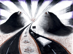 This is the final update on my drawing class, since it's over. Though I'll probably upload some more pictures.
I learned many things in that class. One is that 18 to 25 year old girls are inherently attractive. Okay, I kind of knew that already. The most important things I learned were techniques for mark-making. With that, I'm now more able to translate what I want to draw into what I have drawn. I also learned that I can draw reasonably well and that the reason I could never draw people is that I've never had on sit in front of me for long enough. Maybe my drawings aren't as realistic as my photos, but that's okay and I can live with it.
For the last couple projects, I wanted to break with my pattern of trying for photo-realistic drawings. This one was an assignment to create a drawing inspired by song lyrics or a poem we printed out for class. Once I heard the details of the assignment and how they related to content and subject, I thought maybe Soul Coughing wasn't the best choice of bands. At one point, M. Doughty, the lead vocalist, said "Don't listen to our lyrics, they're just there because they sound good."[citation needed] Their lyrics are mostly stream-of-consciousness poetry with meaning mostly imparted by the listener.
The lyrics I brought in were from one of my favorite Soul Coughing tracks, Screenwriter's Blues. Here are some excerpts from the song that were instrumental in creating my drawing.
Exits to freeways
twisted like knots on
the fingers
jewels cleaving
skin between
breasts.
Your Cadillac breathes
four hundred horses
over blue lines
you are going
to Reseda
to make love
to a model
from Ohio
whose real name
you don't
know
...
And the radioman says
it is a beautiful night out there!
And the radioman says
Rock and Roll lives!
And the radioman says
it is a beautiful night out there
in Los Angeles
you live
in Los Angeles
and you are going to
Reseda; we are all
in some way or
another going to
Reseda someday
to die
and the radioman
laughs because
the radioman fucks
a model too
...
as the radioman says
it is 5 am
and the sun has charred
the other side of
the world and come
back to us
and painted the smoke
over our heads
an imperial violet
it is 5 am
and you are listening
to Los Angeles.
I started taking an art class this summer. It's Drawing 1101 at the University of Minnesota and it's a prerequisite for many art degrees. Since I've been thinking about getting a BFA in photography, I thought I should start somewhere, especially since most of the classes I took when I was in college were in engineering. I still have an interest in engineering, but I'm already a pretty good photograper, so that was the direction I decided to go.
I've learned a few things at this class that I didn't expect to. One is that I can actually draw. I knew I was okay at drafting and representing mechanical and angular shapes, but I didn't expect to discover that I could draw organic shapes as well. Faces are still tough though. The second thing that I learned came completely out of the blue, during an assignment on perspective. It turns out that many "photoshopped" composite photos don't have a consistent vanising point. One more thing to use for spotting the hacks.
So I had to do some "research" and I thought I'd share what I discovered.
So far, I've found that Maxim, FHM, Blender, Zoo and others all seem to have pretty badly designed, bandwidth-intensive websites. I'm guessing that they'd rather you bought the magazine at newsstands or just got a subscription. Maxim seemed to have the most obvious but least irritating problem. When paging through the Girls of Maxim, there are links to the right for "previous girl" and "next girl". As I was paging through the photos in one set, the same girl showed up as both the previous and next girl depending on what photo I was on. I don't think it's cookie related because I'm pretty sure I allowed cookies. On the other hand, it's not like I felt I needed to view their galleries in any particular order, so it was pretty easy to get over that one.
Somewhere in the combination of websites, my browser stopped loading some of the images. Not so good for image based content. Zoo was the most obvious there in that their navigation images of previous, current and next image didn't always have thumbnails and there was no alt text to display when the load failed. You could still click the spaces where images should be, so it wasn't a crippling problem. I suspect bad javascript is the culprit and I can't guarantee what site was the source of the problem since I had several tabs open.
Here's what I've found for style and quality of images so far. All the magazines seem based on getting sexy shots of girls and the quality of those shots isn't really the important part.
Maxim seemed to have the best quality photographs overall along with the best sets and props. Some of the more striking ones being taken with a dual-edgelight set up which is kind of an obvious aproach, but very effective. Their lighting, pose and composition were varied and interesting. They seemed to genuinely want to make good photos that happened to be of hot women in lurid positions and settings.
FHM had the least content. The composition seemed reliable and the poses varied in quality depending on the model in question. The lighting tended to be pretty simple and uninspired, usually a basic beauty light setup. One thing that they had plenty of though, was nipples. Lots of nipples. Generally sitting on huge bags of silicon.
Blender had the standard band promo photos from the record label. It's hard to identify a style there since all the photographs were taken by different people. It felt like trying to define what style defines comic books. Since there is no "Blender style" I'll have to move on from that one.
Zoo, was linked from either Maxim or FHM. I forget which. Again, they tended to have a wide variety of photographs where the important part was that there be a bare-breasted woman in them. Art was generally sacrificed to content, but sometimes they had some real stunners. I couldn't really define a style, but I'll keep trying...
Another thing that I noticed about all these magazines is that they were not above phoning it in and using promotional shots instead of taking their own and that they shared quite a bit among them. I was never on Stuff's website, but I saw several Stuff watermarks.
Anyway, I'll post some stuff from that shoot when it happens and we can all decide if I hit it on the head or not.
--Ben
Comics
AppleGeeks
The Awkward Yeti
Chainsawsuit [new!]
Ctrl+Alt+Del
Doghousediaries
Doonesbury
Formal Sweatpants
FoxTrot
Happle Tea [new!]
Hyperbole and a Half
Indexed
Joy of Tech
Kate or Die!
Lunarbaboon
Our Valued Customers
RealLife
Romantically Apocalyptic
Saturday Morning Breakfast Cereal
Scenes From A Multiverse [new!]
A Softer World
Sci-ence
Sinfest
Three Panel Soul
Wondermark
XKCD
Blogs
Almost Diamonds Antihero As I See It Black and WTF Caerwyn Farm and Spirits The Catty Life Domestic Sluttery Engrish For Goodness Sake Gizmodo Greg Laden Le Zèbre Bleu Lefse and Kimchee Lifehacker Light-test Linux in Exile Man Bytes Blog Photography is Not a Crime Post Secret Photoshop Disasters
Arts
New Pictures 8: Sarah Jones
Minneapolis Institue of Arts
04/18/2013—02/02/2014 - Free
31 Years: Gifts from Martin Weinstein
Minneapolis Institue of Arts
11/02/2013—08/31/2014 - Free
New Pictures 9: Rinko Kawauchi
Minneapolis Institue of Arts
02/20/2014—08/10/2014 - Free
Finland: Designed Environments
Minneapolis Institue of Arts
05/10/2014—08/17/2014 - Free
Music
Nick Cave and the Bad Seeds
at State Theatre
06/21/2014 \ Doors 8:00pm
Please wait while my tweets load